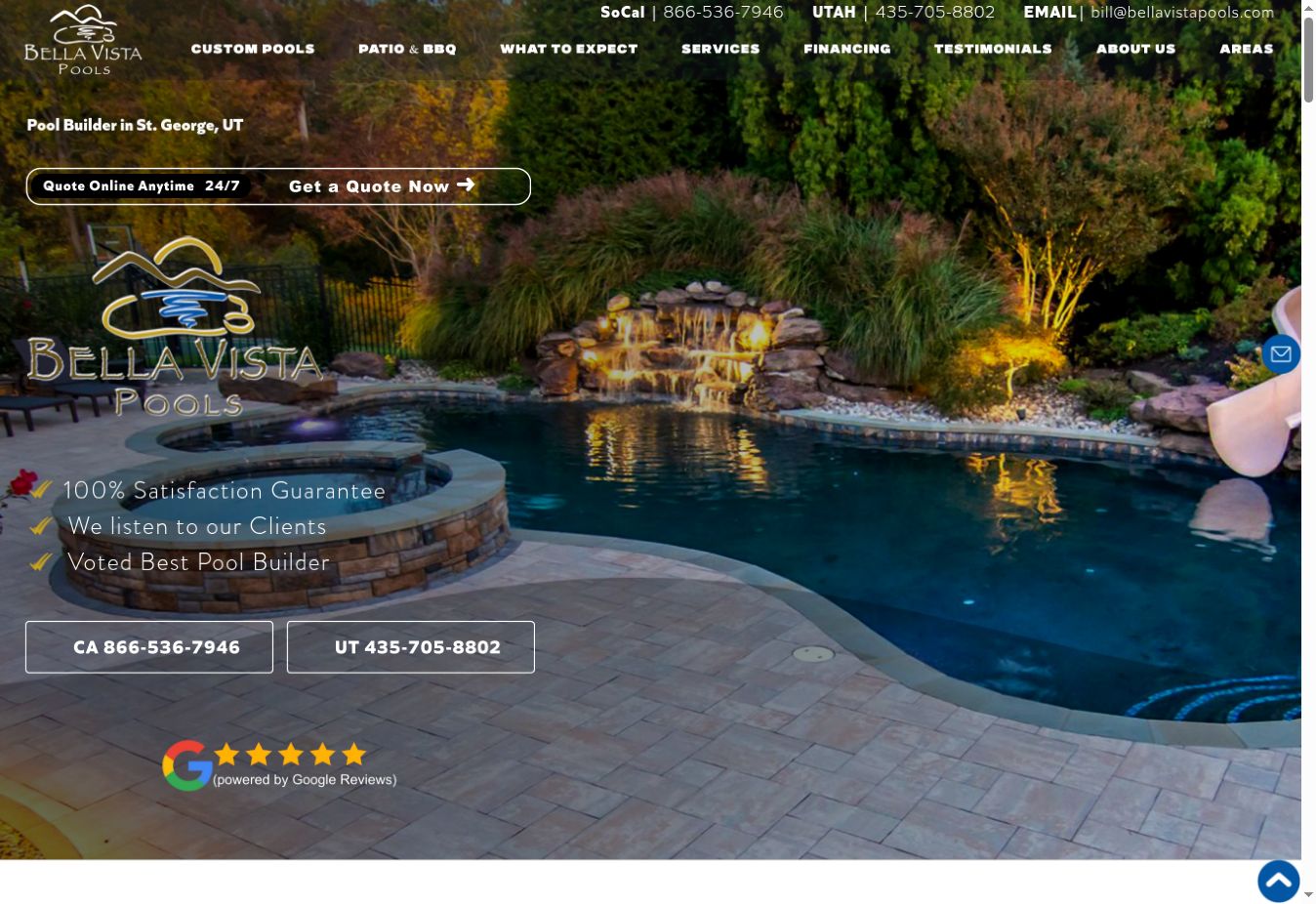
A large repeated logo, review graphic, three claims and multiple contact routes compete with the pool and waterfall.
THE NEW DIRECTION
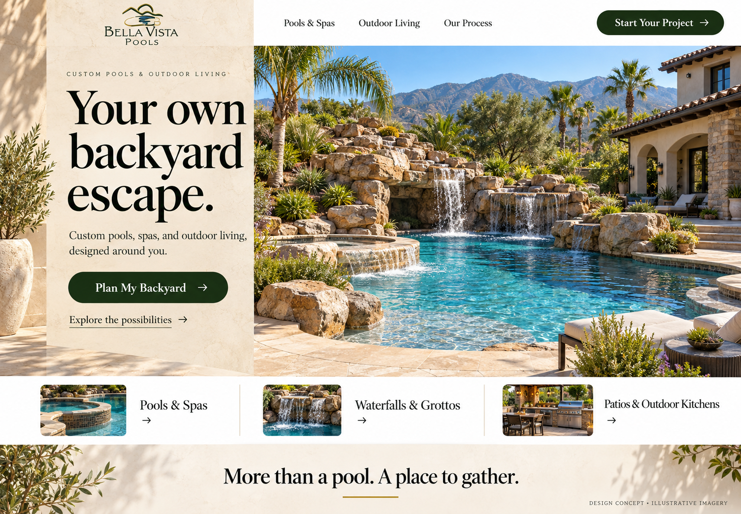
Separate the story from the image: a calm limestone text panel, an open view of the rock waterfall, and one planning button.
THE TRANSFORMATION REPORT
From a busy opening to a backyard you can picture.
Current openingC+Proposed directionA
Editorial assessment of the desktop opening. These grades describe hierarchy, readability and visual direction, not measured business performance.
01 / HIERARCHY
Give the waterfall room to breathe.
Move the message off the photo so the setting is easier to see.
The design reasoning
BeforeThe logo and claims sit over the image, competing with the water and rock features.
ProposedA separate left text panel leaves the right-side pool photograph open.
Why it helpsA homeowner can inspect the kind of backyard environment they want to explore.
02 / SERVICE STORY
Sell the whole backyard possibility.
Name pools, spas and outdoor living together.
The design reasoning
BeforeThe first screen emphasizes a builder label, claims and contact details.
ProposedAn inviting headline and concise service subtitle introduce the experience, with a strip for pools, grottos and outdoor kitchens.
Why it helpsVisitors can connect individual features to how they want to spend time outdoors.
03 / NEXT STEP
Make planning the obvious action.
A single prominent planning button anchors the hero.
The design reasoning
BeforeThe quote bar, California phone, Utah phone and email all compete in the opening.
ProposedPlan My Backyard is the main hero action; explore is a quieter alternative.
Why it helpsSomeone interested in that setting can immediately identify where to start a conversation.
Illustrative design concept, not a completed Bella Vista project. Final imagery would use approved photographs of the company's own work. No conversion or revenue lift is claimed. View the original website ↗